Google+ Blogger WordPress Facebook Like Vkontakte Odnoklassniki LiveJournal vKruguDruzei Facebook Email Gmail
Показаны сообщения с ярлыком декор. Показать все сообщения
пятница, 24 августа 2018 г.

Меню игральные карты на CSS3

источник
Меню работает без применения картинок,все визуальные рисунки и движения являются работой свойств CSS3.Цвет короны и описания ссылок можно изменить на подходящие,они выделены комментарием в коде.Расположение от верхней части страницы отрегулировано с расчётом чтобы осталось место для админ панели,если Вам нужно сместить его ниже или выше,отредактируйте значение для свойства
 Information
Свойство margin это сокращённый способ установить параметры отступов для всех четырёх сторон элемента относительно родительского элемента.Не путать со свойством padding устанавливающим отступ внутри элемента.Для более объективного сценария указывайте расширенные свойства margin.Если вы хотите применить несколько значений расширенных свойств для margin,прописывайте их через пробел,можно указать от одного до четырёх значений.Дополнительно,существует порядок установки расширенных свойств,свойства устанавливаются по часовой стрелке начиная с верхней части.
margin:220px auto;
.
Эта регулировка находится в первом классе,в начале кода здесь ▼..cards 
{
padding:0;
margin:220px auto;
list-style:none;
position:relative;
height:270px;
width:200px;
}
Можно установить весь код по месту установки или вынести код стилей в основной файл CSS,но по возможности старайтесь не перегружать основные стили сайта uCoz.В остальном Вам потребуется только вставить ссылки и добавить к ним описание.Воспользуйтесь редактором HTML который находится ниже для проверки кода на работоспособность.Если что-то не удалось понять,воспользуйтесь формой задачи вопросов по теме находящейся в нижней части материала,опишите подробнее что именно не понятно.

Пример кода меню


среда, 6 июня 2018 г.

Красивые рамки для фотографий

Скопируйте нужный код и установите его в редакторе сообщений в нужном месте, переключившись в режим HTML.

Эффект для рамки 1.
<div class="image-wrapper">
<div class="image-inner">
<img height="320" src="адрес вашего изображения" width="320" />

</div>
</div>
<style>
* {box-sizing: border-box;}
.image-wrapper {
  position: relative;
  max-width: 400px;
  margin: 50px auto;
  padding: 15px;
  background: #FFCCCC;
}
.image-inner {position: relative;}
.image-wrapper img {
  display: block;
  width: 100%;
}
.image-wrapper:before,
.image-wrapper:after,
.image-inner:before,
.image-inner:after {
  content: "";
  position: absolute;
  width: 50px;
  height: 50px;
}
.image-wrapper:before {
  bottom: 0;
  left: 0;
  border-left: 5px double #CC0000;
  border-bottom: 5px double #CC0000;
}
.image-wrapper:after {
  right: 0;
  top: 0;
  border-right: 5px double#CC0000;
  border-top: 5px double #CC0000;
}
.image-inner:before {
  bottom: -15px;
  right: -15px;
  border-right:8px double #CC0000;
  border-bottom: 8px double #CC0000;
}
.image-inner:after {
  top: -15px;
  left: -15px;
  border-left: 5px double #CC0000;
  border-top: 5px double #CC0000;
}</style>
Эффект для рамки 2.
<div class="transform-border">
<img height="320" src="адрес вашего изображения" width="320" />
</div>
<style>
* {box-sizing: border-box;}
.transform-border {
  position: relative;
  max-width: 400px;
  margin: 50px auto;
  transform: perspective(3000px) rotateY(29deg);
}
.transform-border img {
  display: block;
  width: 100%;
  box-shadow: -12px 11px 1px #f2f2f2;
}
.transform-border:after {
  content: "";
  position: absolute;
  width: 100%;
  height: 100%;
  left: -22px;
  top: 22px;
  background: #cccccc;
  z-index: -1;
}</style>
Эффект для рамки 3.
<div class="dbl-border">
<div class="image-wrapper">
<img src="адрес вашего изображения" height="320" width="231" />
  </div>
</div>
<style>
* {box-sizing: border-box;}
.dbl-border {
  position: relative;
  display: table;
  margin: 50px auto;
}
.dbl-border img {display: block;}
.dbl-border:before,
.dbl-border:after {
  content: "";
  position: absolute;
  z-index: 1;
  width: 100%;
  height: 100%;
  border: 2px solid #FF9999;
}
.dbl-border:before {
  top: -15px;
  left: -15px;
}
.dbl-border:after {
  right: -15px;
  bottom: -15px;
}
.image-wrapper {
  position: relative;
  z-index: 2;
  padding: 5px;
  background: white;
  box-shadow: 1px 1px 20px 0 rgba(0, 0, 0, 0.1);
}</style>
Вставьте нужные URL адреса ваших картинок. Попробуйте изменить цвет и ширину рамочек меняя значения border. Практически многие свойства можно заменить и создать свою уникальную рамку для фото.
источник:   http://www.shpargalochki.ru/2018/02/krasivye-ramki-dlya-fotografij.html[/url]


Горизонтальные меню навигации в блог ,8 примеров

Устанавливаются горизонтальные меню в блог довольно просто. В окне "Дизайн" надо выбрать место для добавления гаджета (виджета). Затем на это место вставить гаджет "HTML-javascript", со скопированным в него кодом выбранного горизонтального меню. После этого можно вносить свои правки отступов, рамки, цвета меню, адресов и ссылок, выделенных красным цветом, визуально контролируя изменения. Вообще, редактировать коды на горизонтальные меню можно как в блокноте, так и непосредственно в окне гаджета.
1).3040753_01Snimok (485x42, 1Kb)
Код для меню, что выше:
<style>
#navcontainer { /* none needed */ }
ul#navlist { margin: 0; padding: 0; list-style-type: none; white-space: nowrap; }
ul#navlist li { float: left; font-family: verdana, arial, sans-serif; font-size: 9px; font-weight: bold; margin: 0; padding: 5px 0px 4px 0px; background-color: #666666; border-top: 1px solid #e0ede9; border-bottom: 1px solid #e0ede9; }
#navlist a,
#navlist a:link { margin: 0px; padding: 5px 9px 4px 9px; color: #FFFFFF; border-right: 1px solid #d1e3db; text-decoration: none; }
ul#navlist
li#active { color: #95bbae; background-color: #d1e3db; }
#navlist a:hover { color: #FFFFFF; background-color: #FE9C54; }
</style>
<br />
<div id="navcontainer">
<ul id="navlist">
<li><a href="Адрес страницы">Ссылка 1</a></li>
<li><a href="Адрес страницы">Ссылка 2</a></li>
<li><a href="Адрес страницы">Ссылка 3</a></li>
<li><a href="Адрес страницы">Ссылка 4</a></li>
<li><a href="Адрес страницы">Ссылка 5</a></li>
<li><a href="Адрес страницы">Ссылка 6</a></li>
<li><a href="Адрес страницы">Ссылка 7</a></li>
</ul>
</div>
2).3040753_02Snimok (548x46, 1Kb)
<style>
#navcontainer { float:left; width:100%; background:#FFFFFF; font: bold 7.5pt Verdana; line-height:normal; border-bottom:1px solid #6659A7; border-top:1px solid #6659A7; }
ul#navlist { margin: 0; padding: 0; list-style-type: none; white-space: nowrap; }
ul#navlist li { float: left; font-family: verdana, arial, sans-serif; font-size: 9px; font-weight: bold; margin: 0; padding: 5px 0 4px 0; background-color: #6659A7; border-top: 1px solid #e0ede9; border-bottom: 1px solid #e0ede9; }
 #navlist a,
#navlist a:link { margin: 0; padding: 5px 9px 4px 9px; color: #FFFFFF; border-right: 1px solid #d1e3db; text-decoration: none; }
ul#navlist
li#active { color: #95bbae; background-color: #d1e3db; }
#navlist a:hover { color: #666; background-color: #FFFFFF; }
</style>
<br />
<div id="navcontainer">
<ul id="navlist">
<li><a href="Адрес страницы">Ссылка 1</a></li>
<li><a href="Адрес страницы">Ссылка 2</a></li>
<li><a href="Адрес страницы">Ссылка 3</a></li>
<li><a href="Адрес страницы">Ссылка 4</a></li>
<li><a href="Адрес страницы">Ссылка 5</a></li>
<li><a href="Адрес страницы">Ссылка 6</a></li>
<li><a href="Адрес страницы">Ссылка 7</a></li>
</ul>
</div>
3).3040753_03Snimok (548x61, 1Kb)
<style>
#tabs { font: bold 7.5pt Verdana; }
#navcontainer { float:left; margin: 0; padding: 8px 0px; width:100%; background:#575656; font-size:93%; line-height:normal; }
ul#navlist { margin: 0; padding: 0; list-style-type: none; white-space: nowrap; }
ul#navlist li { float: left; font: bold 7.5pt Verdana; line-height: 14px; margin: 0; padding: 5px 0 5px 0; } #navlist a,
#navlist a:link { margin: 0; padding: 10px; color: #fff; border: 4px solid #575656; text-decoration: none; }
 #navlist a:hover { color: #fff; border: 4px solid #fff; } </style> <br />
<div id="navcontainer">
<ul id="navlist">
<li><a href="Адрес страницы">Ссылка 1</a></li>
<li><a href="Адрес страницы">Ссылка 2</a></li>
<li><a href="Адрес страницы">Ссылка 3</a></li>
<li><a href="Адрес страницы">Ссылка 4</a></li>
<li><a href="Адрес страницы">Ссылка 5</a></li>
<li><a href="Адрес страницы">Ссылка 6</a></li>
</ul>
</div>

4)3040753_04Snimok (460x40, 1Kb)
<style>
#tabs1 { font: bold 7.5pt Verdana; }
#tabs9 img { border: none; }
#navcontainer { margin: 10px 0 0 0px; padding: 0; height: 20px; }
#navcontainer ul { border: 0; margin: 0; padding: 0; list-style-type: none; text-align: center; }
#navcontainer ul li { display: block; float: left; text-align: center; padding: 0; margin: 0; }
#navcontainer ul li a { background: #fff; width: 60px; height: 18px; border-top: 1px solid #ddd; border-left: 1px solid #ddd; border-bottom: 1px solid #ddd; border-right: 1px solid #ddd; padding: 0; margin: 0 0 5px 0; color: #666; text-decoration: none; display: block; text-align: center; font: normal 10px/18px verdana; }
#navcontainer ul li a:hover { color: #6659A7; background: #eeeeee; }
#navcontainer a:active { background: #c60; color: #fff; }
#navcontainer li#active a { background: #c60; border: 1px solid #c60; color: #fff; }
</style> <br />
<div id="navcontainer">
<ul id="navlist">
<li><a href="Адрес страницы">Ссылка 1</a></li>
<li><a href="Адрес страницы">Ссылка 2</a></li>
<li><a href="Адрес страницы">Ссылка 3</a></li>
<li><a href="Адрес страницы">Ссылка 4</a></li>
<li><a href="Адрес страницы">Ссылка 5</a></li>
<li><a href="Адрес страницы">Ссылка 6</a></li>
<li><a href="Адрес страницы">Ссылка 7</a></li>
</ul>
</div>
5)3040753_05Snimok (537x60, 1Kb)
<style>
.container { width: 520px; padding: 0 0 5px 0; margin: 3px 0 10px 0; background: #fff; }
#nav { margin: 0; padding: 0; border-top: 3px solid #5F6A71; }
#nav li { margin: 0; padding: 0; display: inline; list-style-type: none; }
#nav a:link,
#nav a:visited { float: left; font: bold 7.5pt verdana; line-height: 14px; padding: 9px; text-decoration: none; color: #708491; }
#nav a:link.active,
#nav a:visited.active,
#nav a:hover { color: #666; background: url([url]https://blogger.googleusercontent.com/img/b/R29vZ2xl/AVvXsEiKF2gMzhH9P5kl3t66v-M5Qdf3cs2UwP3c2YJo7Bm76YNCDfBvnFplP1y4_CXVoyRPTP4SbIqEIFKmjKSvt1y7WiA5faqLYgu0_I1WjSJZ2dswFXt470U7ycXbhgwcodrMI3warbwQnF4/s1600/Inverted.png[/url]) no-repeat top center; border-top: 4px solid #5F6A71; }
</style>
<br />
<div class="container">
<ul id="nav">
<li><a href="Адрес страницы">Ссылка 1</a></li>
<li><a href="Адрес страницы">Ссылка 2</a></li>
<li><a href="Адрес страницы">Ссылка 3</a></li>
<li><a href="Адрес страницы">Ссылка 4</a></li>
<li><a href="Адрес страницы">Ссылка 5</a></li>
<li><a href="Адрес страницы">Ссылка 6</a></li>
<li><a href="Адрес страницы">Ссылка 7</a></li>
</ul>
</div>
6)3040753_06Snimok (545x64, 1Kb)
<style>
#navcontainer { background: #369; border-top: 1px solid #9CC; margin-top: 20px; font: normal normal 11px Verdana, Geneva, Arial, Helvetica, sans-serif; }
#navlist { list-style: none outside none; margin: 0; padding: 0; } @media all { #navlist { text-align: center } }
#navlist li { bottom: 11px; display: inline; line-height: 1.2em; margin: 0; padding: 0; position: relative; } html>body
#navlist li { background: #000; margin: 0 3px 0 0; padding: 4px 0px 4px 0; }
#navlist a,
#navlist a:link,
#navlist a:visited { background: #900; border: 1px solid #FFF; bottom: 2px; color: #FFF; cursor: pointer; display: inline; height: 1em; margin: 0; padding: 3px 5px 3px 5px; position: relative; right: 2px; text-decoration: none; }
#navlist a:hover { background: #C00; bottom: 1px; color: #FFF; position: relative; right: 1px; }
#navlist a:active { background: #999; bottom: 0px; color: #FFF; position: relative; right: 0px; }
#navlist li#active { background: #369; bottom: 13px; display: inline; margin: 0 3px 0 0; padding: 0; position: relative; } html>body
#navlist li#active { background: #000; margin: 0 4px 0 4px; }
#navlist #active a,
#navlist09 #active a:link,
#navlist09 #active a:visited,
#navlist09 #active a:hover { background: #369; border-bottom: none; border-left: 1px solid #9CC; border-right: 1px solid #9CC; border-top: 1px solid #9CC; bottom: 0; color: #FFF; cursor: text; margin: 0; padding: 2px 5px 0 5px; position: relative; right: 0; } </style> <br />
<div id="navcontainer">
<ul id="navlist">
<li><a href="Адрес страницы">Ссылка 1</a></li>
<li><a href="Адрес страницы">Ссылка 2</a></li>
<li><a href="Адрес страницы">Ссылка 3</a></li>
<li><a href="Адрес страницы">Ссылка 4</a></li>
<li><a href="Адрес страницы">Ссылка 5</a></li>
<li><a href="Адрес страницы">Ссылка 6</a></li>
<li><a href="Адрес страницы">Ссылка 7</a></li>
</ul>
</div>
7)3040753_07Snimok (548x93, 1Kb)
<style>
.container { width: 500px; padding: 15px; margin: 3px 0 20px 0; border: 1px solid #ccc; background: #fff; } /* square */
#navSquare { margin: 0; padding: 0 0 20px 10px; border-bottom: 1px solid #9FB1BC; }
#navSquare li { margin: 0; padding: 0; display: inline; list-style-type: none; }
#navSquare a:link,
#navSquare a:visited { float: left; font-size: 12px; line-height: 14px; font-weight: bold; padding: 0 12px 6px 12px; text-decoration: none; color: #708491; }
#navSquare a:link.active,
#navSquare a:visited.active,
#navSquare a:hover { color: #000; background: url(file://localhost/C:/Program%20Files/CSS%20Tab%20Designer%202/styles/Square/Square.gif) no-repeat bottom center; } </style> <br />
<div class="container">
<ul id="navSquare">
<li><a href="Адрес страницы">Ссылка 1</a></li>
<li><a href="Адрес страницы">Ссылка 2</a></li>
<li><a href="Адрес страницы">Ссылка 3</a></li>
<li><a href="Адрес страницы">Ссылка 4</a></li>
<li><a href="Адрес страницы">Ссылка 5</a></li>
<li><a href="Адрес страницы">Ссылка 6</a></li>
</ul>
</div>
8)3040753_08Snimok (547x71, 2Kb)
<style>
#navcontainer { background: #f0e7d7; margin: 0 auto; padding: .4em 0 .2em 0; font-family: georgia, serif;  font-size: 14px; } /* to stretch the container div to contain floated list */ #navcontainer:after { content: "."; display: block; line-height: 1px; font-size: 1px; clear: both; }
ul#navlist { list-style: none; padding: 0; margin: 0 auto; width: 80%; font-size: 0.8em; }
ul#navlist li { display: block; float: left; margin: 0; padding-bottom: 2px; }
ul#navlist li a { display: block; width: 100%; padding: 0.5em; border-width: 1px; border-color: #ffe #aaab9c #ccc #fff; border-style: solid; color: #777; text-decoration: none; background: #f7f2ea; }
#navcontainer>
ul#navlist li a { width: auto; }
ul#navlist li#active a { background: #f0e7d7; color: #800000; }
ul#navlist li a:hover,
ul#navlist li#active a:hover { color: #800000; background: transparent; border-color: #aaab9c #fff #fff #ccc; }
</style>
<br />
<div id="navcontainer">
<ul id="navlist">
<li><a href="Адрес страницы">Ссылка 1</a></li>
<li><a href="Адрес страницы">Ссылка 2</a></li>
<li><a href="Адрес страницы">Ссылка 3</a></li>
<li><a href="Адрес страницы">Ссылка 4</a></li>
<li><a href="Адрес страницы">Ссылка 5</a></li>
<li><a href="Адрес страницы">Ссылка 6</a></li>
</ul>
</div>
источник:   http://ob-bl.blogspot.com/2014/01/horizont-menu01.html


вторник, 5 июня 2018 г.

Анимированные ссылки

 информация с сайта: https://www.mycrib.ru/2012/05/animirovannye-ssylki-blogger.html
Анимированные ссылки можно вставить в ваш блог Blogspot несколькими способами.

Способ 1. Переливающиеся разными цветами ссылки.

Радужная ссылка
Для того, чтобы получить такую анимированную ссылку(https://www.mycrib.ru/2010/07/html_2182.html), нужно в дизайне блога(http://www.mycrib.ru/2011/10/blogger.html) добавить гаджет HTML / JavaScript с кодом
<script src='http://yourjavascript.com/512719721/rainbow-links.js'>
/*
Rainbow Links Script- TAKANASHI Mizuki
For full source code, 100's more DHTML scripts, and TOS,
Visit http://www.dynamicdrive.com
Via http://www.spiceupyourblog.com
*/
</script>


пятница, 18 мая 2018 г.

Красивый эффект радуги для ссылок

УКРАСИТЬ ССЫЛКИ И ЗАГОЛОВКИ СТАТЕЙ В ВАШЕМ БЛОГЕ. При наведении курсора мышки они будут переливаться всеми цветами радуги.
  идея отсюда:
  https://forbloggerhelp.blogspot.ru/2011/11/krasivyj-jeffekt-radugi-dlja-ssylok-na.html
Виджет: красивый эффект радуги для ссылок на Blogger

Зайдите в Шаблон -- Изменить HTML.С помощью поиска (Ctrl+F) вам надо будет найти эту строку в вашем шаблоне: </head> Перед этой строкой поставьте этот код:

<script src='https://innushka.000webhostapp.com/wp-content/uploads/2018/05/%D1%80%D0%B0%D0%B4%D1%83%D0%B3%D0%B0.js'/>


вторник, 1 мая 2018 г.

Красивое анимированное меню для ярлыков.

Красивое выпадающее анимированное меню для категорий. 
Оно занимает минимум места в боковой панели. Очень функционально и просто красиво смотрится.
Устанавливается оно через гаджет HTML/JavaScript. Сам дизайн меню можно кардинально поменять и подогнать на свой вкус и цвет. Посмотрите о чём идёт речь на этом (http://test-tri.blogspot.ru/) тестовом блоге.
Для начала копируйте следующий код в блокнот или черновик блога.
/*блок меню до  открытия */

<style>.mPanel {width:185px; height:25px;text-align: right;font-family:Georgia;
font-size: 18px;color: #fff;font-weight:bold;
 padding:3px; background:#ccc; border-radius:5px; position:relative; box-shadow:0 0 5px rgba(0,0,0,0.5);}
.miniMenu input {display:none;}
.miniMenu label {display:block; width:48px; height:37px; position:absolute; left:-0px; top:-11px; z-index:10; cursor:pointer;}
.miniMenu div.miniIcon {display:block; width:30px; height:13px; position:absolute; left:10px; top:6px; border:5px solid #fff; border-width:5px 0; z-index:5;
-webkit-transition:0.5s;
-moz-transition:0.5s;
-o-transition:0.5s;

transition:0.5s;
}
.miniMenu div.miniIcon b {display:block; width:30px; height:5px; background:#CC3333 ; position:absolute; left:0; top:4px; opacity:0.7;
-webkit-transition:0.5s;
-moz-transition:0.5s;
-o-transition:0.5s;
transition:0.5s;
}

/*меню после открытия */

.miniMenu ul {list-style:none; position:absolute; top:45px; left:-0px; width:200px; opacity:0.5; visibility:hidden;
-webkit-transition:0.5s;
-moz-transition:0.5s;
-o-transition:0.5s;
transition:0.5s;
}
.miniMenu li {display:block; float:left; position:relative; z-index:10;}
.miniMenu #open:checked ~ .labelOpen {z-index:5;}
.miniMenu #close:checked ~ .labelClose {z-index:5;}
.miniMenu #open:checked ~ div b:first-child {
-webkit-transform:rotate(45deg);
-moz-transform:rotate(45deg);
-ms-transform:rotate(45deg);
-o-transform:rotate(45deg);
transform:rotate(45deg);
}
.miniMenu #open:checked ~ div.miniIcon {
border-color:transparent;
}
.miniMenu #open:checked ~ div b:last-child {
-webkit-transform:rotate(-45deg);
-moz-transform:rotate(-45deg);
-ms-transform:rotate(-45deg);
-o-transform:rotate(-45deg);
transform:rotate(-45deg);
}
.miniMenu #open:checked ~ ul {visibility:visible; opacity:1;}

/*меню при наведении курсора */

.miniMenu li a {display:block; font:500 16px/40px 'Open Sans', arial, sans-serif; text-align:center;font-weight:bold; height:40px; width:200px; position:relative; text-decoration:none; color:#fff;
background-image: -webkit-linear-gradient(#336699, #CCCCFF );
background-image: -ms-linear-gradient(#336699, #CCCCFF );
background-image: -o-linear-gradient(#336699, #CCCCFF );
background-image: linear-gradient(#336699, #CCCCFF );
box-shadow:
inset 0 1px 1px rgba(255,255,255,0.1),
inset 0 -1px 0px rgba(0,0,0,0.2),
0 8px 16px 0 rgba(0,0,0,0.3),
0 4px 4px 0 rgba(0,0,0,0.3),
0 0 0 1px rgba(0,0,0,0.2);
}
.miniMenu li:hover {z-index:100;}
.miniMenu li a:hover {background:#CC9999 ; color:#0000CD; font:500 20px/40px 'Open Sans', arial, sans-serif; text-align:center;font-weight:bold; line-height:41px; width:200px; margin-left:1px;
text-shadow:0 0 1px #fff, 0 0 5px rgba(128,192,128,0.3);
box-shadow:
inset 0 0 4px 3px rgba(0,0,0,0.2),
inset 0 0 10px rgba(0,0,0,0.5);
}
.miniMenu li:first-child a {border-radius:5px 5px 0 0;}
.miniMenu li:last-child a {border-radius:0 0 5px 5px;}
.miniMenu li a:hover:before {content:""; display:block; width:200px; height:3px; position:absolute; left:10px; top:-3px;
background: linear-gradient(to right, rgba(128,192,128,0) 0%, #9999CC 50%, rgba(128,192,128,0) 100%);
}
.miniMenu li a:hover:after {content:""; display:block; width:200px; height:2px; position:absolute; left:10px; bottom:-1px;
background: linear-gradient(to right, rgba(128,192,128,0) 0%, #9999CC 50% ,rgba(128,192,128,0) 100%);
}
</style>

<div class="miniMenu" onclick="">
<div class="mPanel">Ярлыки
  <input id="open" name="miniMenu" type="radio" />
  <input checked="checked" id="close" name="miniMenu" type="radio" />
  <label class="labelOpen" for="open" title="Open Menu"></label>
  <label class="labelClose" for="close" title="Close Menu"></label>

<div class="miniIcon"><b></b><b></b></div>
<ul>
<li><a href="Ссылка">Название</a></li>
<li><a href="Ссылка">название</a></li>
</ul></div></div>

Цветовые решения, размеры высоты и ширины меняйте на ваше усмотрение. Серым цветом я выделила блоки меню в закрытом состоянии, в открытом и эффекты при наведении курсора. Здесь только бы фантазии хватило. Этот пояснительный текст потом можно убрать.

Добавляйте или убирайте строчки <li><a href="Ссылка">название</a></li>. Всё достаточно просто.
http://www.shpargalochki.ru/2015/09/opjat-pro-jarlyki-v-bloggere.html#more


понедельник, 16 апреля 2018 г.

Вертикальное аккордеон меню на CSS3 и jQuery


Вот как оно, меню, выглядит
DEMO 
Установка:

Для на чала пропишим стили аккордеона, в css вставляете код:
  1. .accordion-container{
  2.            position: relative;
  3.            width: 500px;
  4.            height: auto;
  5.            margin: 20px auto;
  6. }
  7. .accordion-container > h2{
  8.            text-align: center;
  9.            color: #fff;
  10.            padding-bottom: 5px;
  11.            margin-bottom: 30px;
  12.            border-bottom: 1px solid #ddd;
  13. }
  14. .set{
  15.            position: relative;
  16.            width: 100%;
  17.            height: auto;
  18.            background-color: #f5f5f5;
  19. }
  20. .set > a{
  21.            display: block;
  22.            padding: 10px 15px;
  23.            text-decoration: none;
  24.            color: #555;
  25.            font-weight: 600;
  26.            border-bottom: 1px solid #ddd;
  27.            -webkit-transition:all 0.2s linear;
  28.            -moz-transition:all 0.2s linear;
  29.            transition:all 0.2s linear;
  30. }
  31. .set > a i{
  32.            position:relative;
  33.            float: right;
  34.            margin-top:4px;
  35.            color: #666;
  36. }
  37. .set > a.active{
  38.            background-color:#3399cc;
  39.            color: #fff;
  40. }
  41. .set > a.active i{
  42.            color: #fff;
  43. }
  44. .content-accordion{
  45.            position:relative;
  46.            width: 100%;
  47.            height: auto;
  48.            background-color: #fff;
  49.            border-bottom: 1px solid #ddd;
  50.            display:none;
  51. }
  52. .content-accordion p{
  53.            padding: 10px 15px;
  54.            margin: 0;
  55.            color: #333;
  56. }
Где хотите видеть аккордеон вкладки вставляете код:
  1. <div class="accordion-container">
  2.            <div class="set">
  3.            <a href="#">
  4.            Первая вкадка
  5.            <i class="fa fa-plus"></i>
  6.            </a>
  7.            <div class="content-accordion">
  8.            <p>Содержимое 1 вкладки</p>
  9.            </div>
  10.            </div>
  11.            <div class="set">
  12.            <a href="#">
  13.            Вторая вкладка
  14.            <i class="fa fa-plus"></i>
  15.            </a>
  16.            <div class="content-accordion">
  17.            <p>Содержимое 2 вкладки</p>
  18.            </div>
  19.            </div>
  20.            <div class="set">
  21.            <a href="#">
  22.            Третья вкладка
  23.            <i class="fa fa-plus"></i>
  24.            </a>
  25.            <div class="content-accordion">
  26.            <p>Содержимое 3 вкладки</p>
  27.            </div>
  28.            </div>
  29.            <div class="set">
  30.            <a href="#">
  31.            Четвертая вкладка
  32.            <i class="fa fa-plus"></i>           
  33.            </a>
  34.            <div class="content-accordion">
  35.            <p>Содержимое 4 вкладки</p>
  36.            </div>
  37.            </div>
  38. </div>

Ну и перед закрывающим тегом </body> вставляете код:
  1. <script>$(document).ready(function(){
  2.            $(".set > a").on("click", function(){
  3.            if($(this).hasClass('active')){
  4.            $(this).removeClass("active");
  5.            $(this).siblings('.content-accordion').slideUp(200);
  6.            $(".set > a i").removeClass("fa-minus").addClass("fa-plus");
  7.            }else{
  8.            $(".set > a i").removeClass("fa-minus").addClass("fa-plus");
  9.            $(this).find("i").removeClass("fa-plus").addClass("fa-minus");
  10.            $(".set > a").removeClass("active");
  11.            $(this).addClass("active");
  12.            $('.content-accordion').slideUp(200);
  13.            $(this).siblings('.content-accordion').slideDown(200);
  14.            }
  15.                      
  16.            });
  17. });</script>

Я взял на себя инициативу и добавил в скрипт функцию, которая скрывает подменю по повторному клику на ссылку раздела, в оригинале, на сайте создателя (DesignModo) этого чудесного меню, ее не было. Мне, почему-то так больше нравится, иначе постоянно виден какой-то из открытых разделов, а так, захотел - скрыл.
По многочисленным просьбам, в статье Улучшенный скрипт для вертикального аккордеон меню выкладываю другой(дополненный) вариант скрипта этого меню, с открытием раздела и подсветкой ссылки соответствующей текущей страницы.

Как установить данное аккордеон меню в блог на Blogger

1. Проверяете подключен ли к вашему блогу фрейиворк jQeury. Если нет и ранее вы этого не делали - подключаете, подробнее как это сделать читайте здесь.
2. Создаете новый гаджет HTML/JavaScript и размещаете в нем, HTML код менюшки, стили и скрипт.
CSS код в гаджете размешается между тегами <style>/</style>;
Скрипт - между тегами <script>/</script>
Никаких манипуляций непосредственно с кодом шаблона производить не нужно. скачать
источник

Получил я в комментариях заявку: "Подскажите, а у вас нет случайно скрипта для вертикального меню, типа Аккордеон?" И появилась у меня идея опубликовать пост на эту тему.
3040753_beautifulaccordion (274x220, 22Kb)
Как выглядит меню, можно посмотреть на тестовом блоге: [url]http://blogodeltest2.blogspot.com/[/url]
Сам скрипт вставляется просто: надо добавить код: В Дизайн - Добавить гаджет - HTML/JavaScript (жёлтый) фон это цвет меню, который можно поменять).
<style>
#mymenu  {
 width: 200px;
 margin: 0 auto;
}
#mymenu .mydiv {
 width: 200px;/*ширина всего меню*/
 transition: height ease-in-out 500ms;
 -o-transition: height ease-in-out 500ms;
 -moz-transition: height ease-in-out 500ms;
 -webkit-transition: height ease-in-out 500ms;
 border-radius: 15px;
 -moz-border-radius: 15px;
 -webkit-border-radius: 15px;
}
.mydiv h3{height: 45px;
 cursor:pointer;
 margin: 0 0 0 0;
 text-align: center;
 color:white;padding: 12px 0px 0px 0px;
 border-radius: 8px;
 -moz-border-radius: 8px;
 -webkit-border-radius: 8px;
 background: #999999;/*цвет наружного меню*/ 
}
#mymenu p {
 text-align: center;
 margin: 0 0 1px 0;
 height: 0px;
 overflow: hidden;
 transition: height ease-in-out 500ms;
 -o-transition: height ease-in-out 500ms;
 -moz-transition: height ease-in-out 500ms;
 -webkit-transition: height ease-in-out 500ms;
 border-radius: 8px;
 -moz-border-radius: 8px;
 -webkit-border-radius: 8px;
 background: #cccccc; /*цвет фона внутреннего меню*/
filter: progid:DXImageTransform.Microsoft.gradient
        ( startColorstr='#E1A3370', endColorstr='#E1A337',GradientType=0 );
}

#mymenu p:hover {
 background: #999999;
 cursor:pointer;
}
#mymenu div:hover  > p {
 height: 45px;padding: 12px 0px 0px 0px;
}

* html #mymenu .mydiv  {
 filter: progid:DXImageTransform.Microsoft.gradient
        (startColorstr='#4EAEC1', endColorstr='#055261',GradientType=0 );
 height: 45px;
 overflow: hidden;
 forIE: expression(
  onmouseover = function()  {this.className += ' hover'},
  onmouseout = function() {this.className = this.className.replace('hover', '')}
  );
}
* html #mymenu .mydiv.hover  {
 height: auto;
}
#mymenu p a {
 color:white;
}
</style>

<div  id="mymenu">
    <div class="mydiv">
        <h3 >Меню 1</h3>
  <p><a href = "#">Под меню1</a></p>
  <p><a href = "#">Под меню2</a></p>
 </div>
    <div class="mydiv">
  <h3>Меню 2</h3>
  <p><a href = "#">Под меню1</a></p>
  <p><a href = "#">Под меню2</a></p>
  <p><a href = "#">Под меню3</a></p>
    </div>
    <div class="mydiv">
 <h3>Меню 3</h3>
  <p><a href = "#">Под меню1</a></p>
  <p><a href = "#">Под меню2</a></p>
  <p><a href = "#">Под меню3</a></p>
  <p><a href = "#">Под меню4</a></p>
     </div>
    <div class="mydiv">
 <h3>Меню 4</h3>
  <p><a href = "#">Под меню1</a></p>
  <p><a href = "#">Под меню2</a></p>
  <p><a href = "#">Под меню3</a></p>
  <p><a href = "#">Под меню4</a></p>
  <p><a href = "#">Под меню5</a></p>
    </div></div>
Горизонтальное выпадащее меню
код добавить: В Дизайн - Добавить гаджет - HTML/JavaScript
<style>/* Главное меню */
#menu
{
width: 100%;
margin: 0;
padding: 10px 0 0 0;
list-style: none;
background: #874006;
background: -moz-linear-gradient(#BF6306, #874006);
background: -webkit-gradient(linear,left bottom,left top,color-stop(0, #874006),color-stop(1, #BF6306));
background: -webkit-linear-gradient(#BF6306, #874006);
background: -o-linear-gradient(#BF6306, #874006);
background: -ms-linear-gradient(#BF6306, #874006);
background: linear-gradient(#BF6306, #874006);
-moz-border-radius: 50px;
border-radius: 50px;
-moz-box-shadow: 0 2px 1px #874006;
-webkit-box-shadow: 0 2px 1px #874006;
box-shadow: 0 2px 1px #874006;
}
#menu li
{
float: left;
padding: 0 0 10px 0;
position: relative;
}
#menu a
{
float: left;
height: 25px;
padding: 0 25px;
color: #ffffff;
text-transform: uppercase;
font: bold 12px/25px Arial, Helvetica;
text-decoration: none;
text-shadow: 0 1px 0 #000;
}
#menu li:hover > a
{
color: #fafafa;
}
*html #menu li a:hover /* IE6 */
{
color: #fafafa;
}
#menu li:hover > ul
{
display: block;
}
/* Подменю */
#menu ul
{
list-style: none;
margin: 0;
padding: 0;
display: none;
position: absolute;
top: 35px;
left: 0;
z-index: 99999;
background: #BF6306;
background: -moz-linear-gradient(#BF6306, #783B08);
background: -webkit-gradient(linear,left bottom,left top,color-stop(0, #783B08),color-stop(1, #BF6306));
background: -webkit-linear-gradient(#BF6306, #783B08);
background: -o-linear-gradient(#BF6306, #783B08);
background: -ms-linear-gradient(#BF6306, #783B08);
background: linear-gradient(#BF6306, #783B08);
-moz-border-radius: 5px;
border-radius: 5px;
}
#menu ul li
{
float: none;
margin: 0;
padding: 0;
display: block;
-moz-box-shadow: 0 1px 0 #111111, 0 2px 0 #777777;
-webkit-box-shadow: 0 1px 0 #111111, 0 2px 0 #777777;
box-shadow: 0 1px 0 #111111, 0 2px 0 #777777;
}
#menu ul li:last-child
{
-moz-box-shadow: none;
-webkit-box-shadow: none;
box-shadow: none;
}
#menu ul a
{
padding: 10px;
height: auto;
line-height: 1;
display: block;
white-space: nowrap;
float: none;
text-transform: none;
}
*html #menu ul a /* IE6 */
{
height: 10px;
width: 150px;
}
*:first-child+html #menu ul a /* IE7 */
{
height: 10px;
width: 150px;
}
#menu ul a:hover
{
background: #9A1B19;
background: -moz-linear-gradient(#562F24,  #9A1B19);
background: -webkit-gradient(linear, left top, left bottom, from(#562F24), to(#9A1B19));
background: -webkit-linear-gradient(#562F24,  #9A1B19);
background: -o-linear-gradient(#562F24,  #9A1B19);
background: -ms-linear-gradient(#562F24,  #9A1B19);
background: linear-gradient(#562F24,  #9A1B19);
}
#menu ul li:first-child a
{
-moz-border-radius: 5px 5px 0 0;
border-radius: 5px 5px 0 0;
}
#menu ul li:first-child a:after
{
content: '';
position: absolute;
left: 30px;
top: -8px;
width: 0;
height: 0;
border-left: 5px solid transparent;
border-right: 5px solid transparent;
border-bottom: 8px solid #874006;
}
#menu ul li:first-child a:hover:after
{
border-bottom-color: #5D2D23;
}
#menu ul li:last-child a
{
-moz-border-radius: 0 0 5px 5px;
border-radius: 0 0 5px 5px;
}
#menu:after
{
visibility: hidden;
display: block;
font-size: 0;
content: " ";
clear: both;
height: 0;
}
* html #menu             { zoom: 1; } /* IE6 */
*:first-child+html #menu { zoom: 1; } /* IE7 */
#menu ul li:first-child a:after
{
    content: '';
    position: absolute;
    left: 30px;
    top: -8px;
    width: 0;
    height: 0;
    border-left: 5px solid transparent;
    border-right: 5px solid transparent;
    border-bottom: 8px solid #BF6306;
}
#menu ul li:first-child a:hover:after
{
    border-bottom-color: #5D2D23;
}
* html #menu             { zoom: 1; } /* IE6 */
*:first-child+html #menu { zoom: 1; } /* IE7 */
</style><ul id="menu">
  <li><a href="#">ГЛАВНАЯ</a></li>
  <li>
  <a href="#">КАТЕГОРИИ</a>
        <ul>
        <li><a href="#">Виджеты</a></li>
        <li><a href="#">Украшения</a></li>
        <li><a href="#">Настройка блога</a></li>
        <li><a href="#">Сервисы</a></li>
        </ul>
  </li>
  <li><a href="#">РОК'Н'РОЛЛ</a>
  <ul>
        <li><a href="#">Музыка</a></li>
        <li><a href="#">Биографии</a></li>
  </ul>
  </li>
  <li><a href="#">О ПРОЕКТЕ</a></li>
  <li><a href="#">КОНТАКТЫ</a></li>
</ul>


Красивое оформление древовидных комментариев .

http://blogodel.com/
Все коды вставляются в: Дизайн - Добавить гаджет - HTML/JavaScript

Все скриншоты сделаны с тестового блога, где комментарии были опробованы!
Скриншот № 1 цветной
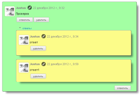
Код № 1
<style>

.comments .comment .comment-actions a, .comments .continue a {box-shadow:0 1px 4px rgba(0, 0, 0, 0.3), 0 0 5px rgba(0, 0, 0, 0.1) inset;

   border: 1px solid #DDD;

   margin: 0 2px;
   text-decoration: none;
   border-radius: 4px;
   text-shadow: 0 1px 1px white;

   font: bold 11px Sans-Serif;
   padding: 2px 10px;
   white-space: nowrap;
   vertical-align: middle;
   color: #666;
   background: -webkit-linear-gradient(top, #fbfaf8, gainsboro);
   background:    -moz-linear-gradient(top, #fbfaf8, gainsboro);
   background:     -ms-linear-gradient(top, #fbfaf8, gainsboro);
   background:      -o-linear-gradient(top, #fbfaf8, gainsboro);
   text-transform: lowercase;}

.comments .comment .comment-actions a:hover, .comments .continue a:hover {
   box-shadow:         inset 0 1px 2px #c4c4c4;
   border: 1px solid #AAA;
   border-top-color: #999;
   text-decoration: none;}

.thread-toggle {
   border-radius: 4px 4px 0 0;
   border-top: 2px solid $(link.hover.color);
   text-shadow: 0 1px 1px white;
   font: bold 11px Sans-Serif;
   padding: 2px 10px;
   white-space: nowrap;
   vertical-align: middle;
   color: #666;
   text-transform: lowercase;}

.thread-toggle a{text-decoration: none;}

.comments .continue a {
   float: right;   
   border-radius: 0 0 4px 4px;}
.comments .comments-content .avatar-image-container{border: 4px solid #fcfbf5;border-radius: 5px;box-shadow:0 1px 4px rgba(0, 0, 0, 0.3), 0 0 5px rgba(0, 0, 0, 0.1) inset;}
  
.comments .comments-content .comment-thread ol li, .comments .comments-content .comment-thread ol li ol li{ 
  border: 1px groove #acacac; 
  padding: 10px; 
  border-radius: 5px;
  box-shadow: -moz-box-shadow: 1em 1em 1em -0.5em rgba(0,0,6,0.5);
-webkid-box-shadow: 1em 1em 1em -0.5em rgba(0,0,6,0.5);
box-shadow: 1em 1em 1em -0.5em rgba(0,0,6,0.5);
}

.comments .comments-content .comment-thread ol li:last-child { padding-bottom: 5px; }

.comments .comments-content .comment-thread ol li:nth-of-type(even) { background: #9bffff; }

.comments .comments-content .comment-thread ol li:nth-of-type(odd) { background: #a3ffa3; }

.comments .comments-content .comment-thread ol li ol li:nth-of-type(odd), .comments .comments-content .comment-thread ol li ol li:nth-of-type(even){ background: #fcfc89; }</style>

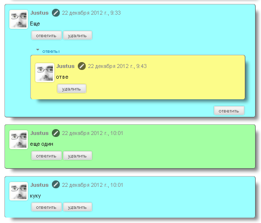
Следующий вариант, назовем его "Вариант №2"
Скриншот № 2
Код № 2
<style>
.comments .comment .comment-actions a, .comments .continue a {box-shadow:0 1px 4px rgba(0, 0, 0, 0.3), 0 0 5px rgba(0, 0, 0, 0.1) inset;
   border: 1px solid #DDD;
   margin: 0 2px;
   text-decoration: none;
   border-radius: 4px;
   text-shadow: 0 1px 1px white;
   font: bold 11px Sans-Serif;
   padding: 2px 10px;
   white-space: nowrap;
   vertical-align: middle;
   color: #666;
   background: -webkit-linear-gradient(top, #fbfaf8, gainsboro);
   background:    -moz-linear-gradient(top, #fbfaf8, gainsboro);
   background:     -ms-linear-gradient(top, #fbfaf8, gainsboro);
   background:      -o-linear-gradient(top, #fbfaf8, gainsboro);
   text-transform: lowercase;}
.comments .comment .comment-actions a:hover, .comments .continue a:hover {
   box-shadow:         inset 0 1px 2px #c4c4c4;
   border: 1px solid #AAA;
   border-top-color: #999;
   text-decoration: none;}
.thread-toggle {
   border-radius: 4px 4px 0 0;
   border-top: 2px solid $(link.hover.color);
   text-shadow: 0 1px 1px white;
   font: bold 11px Sans-Serif;
   padding: 2px 10px;
   white-space: nowrap;
   vertical-align: middle;
   color: #666;
   text-transform: lowercase;}
.thread-toggle a{text-decoration: none;}
.comments .continue a {
   float: right;   
   border-radius: 0 0 4px 4px;}
.comments .comments-content .avatar-image-container{border: 4px solid #fcfbf5;border-radius: 5px;box-shadow:0 1px 4px rgba(0, 0, 0, 0.3), 0 0 5px rgba(0, 0, 0, 0.1) inset;}
.comments .comments-content .comment-thread ol li, .comments .comments-content .comment-thread ol li ol li{ 
  border: 1px groove #acacac; 
  padding: 10px; 
  border-radius: 5px;
  box-shadow: -moz-box-shadow: 1em 1em 1em -0.5em rgba(0,0,6,0.5);
-webkid-box-shadow: 1em 1em 1em -0.5em rgba(0,0,6,0.5);
box-shadow: 1em 1em 1em -0.5em rgba(0,0,6,0.5);
}
.comments .comments-content .comment-thread ol li:last-child { padding-bottom: 5px; }
.comments .comments-content .comment-thread ol li:nth-of-type(even) { background: #9bffff; }
.comments .comments-content .comment-thread ol li:nth-of-type(odd) { background: #a3ffa3; }
.comments .comments-content .comment-thread ol li ol li:nth-of-type(odd), .comments .comments-content .comment-thread ol li ol li:nth-of-type(even){ background: #fcfc89; }</style>

Вариант № 3
Скриншот варианта № 3
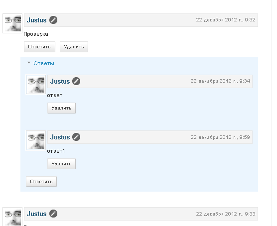
Код № 3
<style>
.comments {
clear: both;
margin-top: 10px;
margin-bottom: 0px;
line-height: 1em;
}
.comments .comments-content {
font-size: 12px;
margin-bottom: 16px;
font-weight: normal;
text-align:left;
line-height: 1.4em;
}
.comments .comment .comment-actions a {
display: inline-block;
margin: 0;
padding: 1px 6px;
border: 1px solid #C4C4C4;
border-top-color: #E4E4E4;
border-left-color: #E4E4E4;
color: #424242 !important;
text-align: center;
text-shadow: 0 -1px 0 white;
text-decoration: none;
-webkit-border-radius: 2px;
-moz-border-radius: 2px;
border-radius: 2px;
background: #EDEDED;
background: -webkit-gradient( linear, left top, left bottom, color-stop(.2, white), color-stop(1, #E5E5E5) );
background: -moz-linear-gradient( center top, white 20%, #E5E5E5 100% );
font: 11px/18px sans-serif;
padding:2px 8px; margin-right:10px;
}
.comments .comment .comment-actions a:hover {
text-decoration: none; background:#fff; border:1px solid #5AB1E2;
}
.comments .comments-content .comment-thread ol {
list-style-type: none;
padding: 0;
text-align: none;
}
.comments .comments-content .inline-thread {
padding: 0.5em 1em;
}
.comments .comments-content .comment-thread {
margin: 8px 0px;
}
.comments .comments-content .comment-thread:empty {
display: none;
}
.comments .comments-content .comment-replies {
margin-top: 1em;
margin-left: 40px; font-size:12px; background:#EBF5FE;
}
.comments .comments-content .comment {
margin-bottom:16px;
padding-bottom:8px;
}
.comments .comments-content .comment:first-child {
padding-top:16px;
}
.comments .comments-content .comment:last-child {
border-bottom:0;
padding-bottom:0;
}
.comments .comments-content .comment-body {
position:relative;
}
.comments .comments-content .user {
font-style:normal;
font-weight:bold;
}
.comments .comments-content .user a {
color:#2D5E7B; font-size:14px; font-weight: bold;text-decoration: none;
}
.comments .comments-content .icon.blog-author {
width: 18px;
height: 18px;
display: inline-block;
margin: 0 0 -4px 6px;
}
.comments .comments-content .datetime {
color: #999999;
float: right;
font-size: 11px;
text-decoration: none;
}
.comments .comments-content,
.comments .comments-content .comment-content {
margin:0 0 8px;
}

.comment-header {background-color: #F4F4F4;
border: thin solid #E6E6E6;
margin-bottom: 5px;
padding: 5px;
}
.comments .comments-content .comment-content {
text-align:none;
}
.comments .comments-content .owner-actions {
position:absolute;
right:0;
top:0;
}
.comments .comments-replybox {
border: none;
height: 250px;
width: 100%;
}
.comments .comment-replybox-single {
margin-top: 5px;
margin-left: 48px;
}
.comments .comment-replybox-thread {
margin-top: 5px;
}
.comments .comments-content .loadmore a {
display: block;
padding: 10px 16px;
text-align: center;
}
.comments .thread-toggle {
cursor: pointer;
display: inline-block;
}
.comments .continue {
cursor: pointer;
}
.comments .continue a {
display: inline-block;
margin: 0;
padding: 1px 6px;
border: 1px solid #C4C4C4;
border-top-color: #E4E4E4;
border-left-color: #E4E4E4;
color: #424242 !important;
text-align: center;
text-shadow: 0 -1px 0 white;
text-decoration: none;
-webkit-border-radius: 2px;
-moz-border-radius: 2px;
border-radius: 2px;
background: #EDEDED;
background: -webkit-gradient( linear, left top, left bottom, color-stop(.2, white), color-stop(1, #E5E5E5) );
background: -moz-linear-gradient( center top, white 20%, #E5E5E5 100% );
font: 11px/18px sans-serif;
padding:2px 8px; margin-right:10px;
}
.comments .comments-content .loadmore {
cursor: pointer;
max-height: 3em;
margin-top: 3em;
}
.comments .comments-content .loadmore.loaded {
max-height: 0px;
opacity: 0;
overflow: hidden;
}
.comments .thread-chrome.thread-collapsed {
display: none;
}
.comments .thread-toggle {
display: inline-block;
}
.comments .thread-toggle .thread-arrow {
display: inline-block;
height: 6px;
width: 7px;
overflow: visible;
margin: 0.3em;
padding-right: 4px;
}
.comments .thread-expanded .thread-arrow {
background: url("data:image/png;base64,iVBORw0KGgoAAAANSUhEUgAAAAc AAAAHCAYAAADEUlfTAAAAG0lEQVR42mNgwAfKy8v/48I4FeA0AacVDFQBAP9wJkE/KhUMAAAAAElFTkSuQmCC") no-repeat scroll 0 0 transparent;
}
.comments .thread-collapsed .thread-arrow {
background: url("data:image/png;base64,iVBORw0KGgoAAAANSUhEUgAAA AcAAAAHCAYAAADEUlfTAAAAJUlEQVR42mNgAILy8vL/DLgASBKnApgkVgXIkhgKiNKJ005s4gDLbCZBiSxfygAAAAB JRU5ErkJggg==") no-repeat scroll 0 0 transparent;
}
.comments .avatar-image-container {background-image: url("http://img846.imageshack.us/img846/7357/unled1oww.jpg");background-position: center center;background-repeat: no-repeat;float: left;width: 36px;max-height: 36px;margin: 0;outline: 1px solid #FFFFFF;padding: 3px;vertical-align: middle;overflow: hidden;
border: 1px solid #DDDDDD;}
.comments .avatar-image-container img {
width: 36px;
}
.comments .comment-block {
margin-left: 48px;
position: relative;
}
@media screen and (max-device-width: 480px) {
.comments .comments-content .comment-replies {
margin-left: 0;
}
}
</style>

И наконец вариант № 4. Скриншот варианта № 4
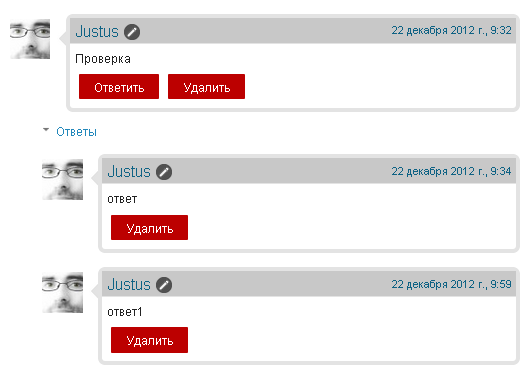
Код № 4

<style>
.comments{clear:both;margin-top:10px;margin-bottom:0;font-family:Arial;line-height:18px;font-size:13px}
.comments .comments-content{margin-bottom:16px;font-weight:normal;text-align:left}
.comments .comment .comment-actions a,.comments .comment .continue a{display:inline-block;margin:0 0 10px 10px;padding:0 15px;color:#ffffff !important;text-align:center;text-decoration:none;background:#bc0000;border:1px solid #bc0000;border-radius:2px;height:26px;line-height:28px;font-weight:normal;cursor:pointer}
.comments .comments-content .comment-thread ol{list-style-type:none;padding:0;text-align:none}
.comments .comments-content .inline-thread{padding:0}
.comments .comments-content .comment-thread{margin:8px 0}
.comments .comments-content .comment-thread:empty{display:none}
.comment-replies{margin-top:1em;margin-left:40px;background:#fff}
.comments .comments-content .comment{margin-bottom:0;padding-bottom:0}
.comments .comments-content .comment:first-child{padding-top:16px}
.comments .comments-content .comment:last-child{border-bottom:0;padding-bottom:0}
.comments .comments-content .comment-body{position:relative}
.comments .comments-content .user{font-style:normal;font-weight:normal}
.comments .comments-content .user a{color:#0E6284;font-weight:normal;text-decoration:none}
.comments .comments-content .icon.blog-author{width:18px;height:18px;display:inline-block;margin:0 0 -4px 6px}
.comments .comments-content .datetime a{color:#0E6284;font-size:12px;float:right;text-decoration:none}
.comment-content{margin:0 0 8px;padding:0 5px}
.comment-header{font-size:18px;background-color:#c8c8c8;border-bottom:1px solid #e3e3e3;padding:5px}
.comments .comments-content .owner-actions{position:absolute;right:0;top:0}
.comments .comments-replybox{border:none;height:230px;width:100%}
.comments .comment-replybox-thread{margin-top:0}
.comments .comment-replybox-single{margin-top:5px;margin-left:48px}
.comments .comments-content .loadmore a{display:block;padding:10px 16px;text-align:center}
.comments .thread-toggle{cursor:pointer;display:inline-block}
.comments .comments-content .loadmore{cursor:pointer;max-height:3em;margin-top:0}
.comments .comments-content .loadmore.loaded{max-height:0;opacity:0;overflow:hidden}
.comments .thread-chrome.thread-collapsed{display:none}
.comments .thread-toggle{display:inline-block}
.comments .thread-toggle .thread-arrow{display:inline-block;height:6px;width:7px;overflow:visible;margin:0.3em;padding-right:4px}
.comments .thread-expanded .thread-arrow{background:url("data:image/png;base64,iVBORw0KGgoAAAANSUhEUgAAAAc AAAAHCAYAAADEUlfTAAAAG0lEQVR42mNgwAfKy8v/48I4FeA0AacVDFQBAP9wJkE/KhUMAAAAAElFTkSuQmCC") no-repeat scroll 0 0 transparent}
.comments .thread-collapsed .thread-arrow{background:url("data:image/png;base64,iVBORw0KGgoAAAANSUhEUgAAA AcAAAAHCAYAAADEUlfTAAAAJUlEQVR42mNgAILy8vL/DLgASBKnApgkVgXIkhgKiNKJ005s4gDLbCZBiSxfygAAAAB JRU5ErkJggg==") no-repeat scroll 0 0 transparent}
.avatar-image-container{background:url(https://blogger.googleusercontent.com/img/b/R29vZ2xl/AVvXsEioGWZxETjTUPpDG8W3kRxL26tjAOY5zOMqxcpNOQTvtqnthrNSVJ75JizW7PovSyoGksTvSbAXQfIIegxybjF8h24CpRULlXA4R9P_Im5p8S8blDZu-2IYzpIxfI4RFMMKJBqSM-E_yK3h/s1600/rb+arrow.png) top right no-repeat;float:left;vertical-align:middle;overflow:hidden;width:65px !important;height:51px !important;max-width:65px !important;max-height:51px !important}
.comments .avatar-image-container img{padding:2px;border:1px solid #ccc;width:45px !important;height:45px !important;max-width:45px !important;max-height:45px !important}
.comments .comment-block{margin-left:65px;position:relative;border:5px solid #e3e3e3;border-radius:8px}
@media screen and (max-device-width:100%){.comments .comments-content .comment-replies{margin-left:0}}
</style>
источник:
http://blogodel.com/2012/12/drevovidnye-kommentarii-blogspot-blogger.html?showComment=1522411096474#c2131472381219150519